

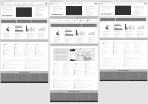


Design is rarely linear. During ideation, surplus ideas often evolve organically into the design phase. My USTrotting emerged as a holistic, personalized dashboard—empowering users to tailor content based on their role, preferences, and needs. This innovative approach elevated usability, strengthened engagement, and positioned USTrotting to improve membership retention.
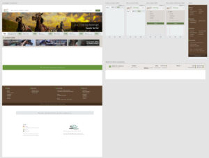
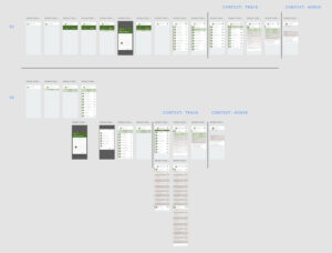
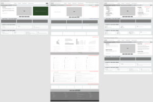
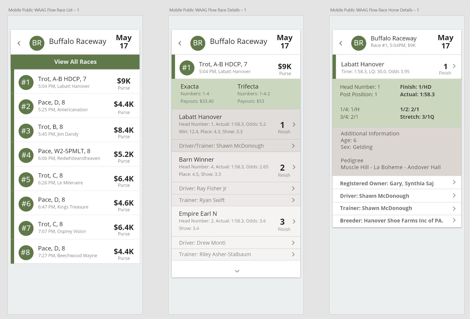
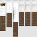
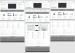
Low Fidelity
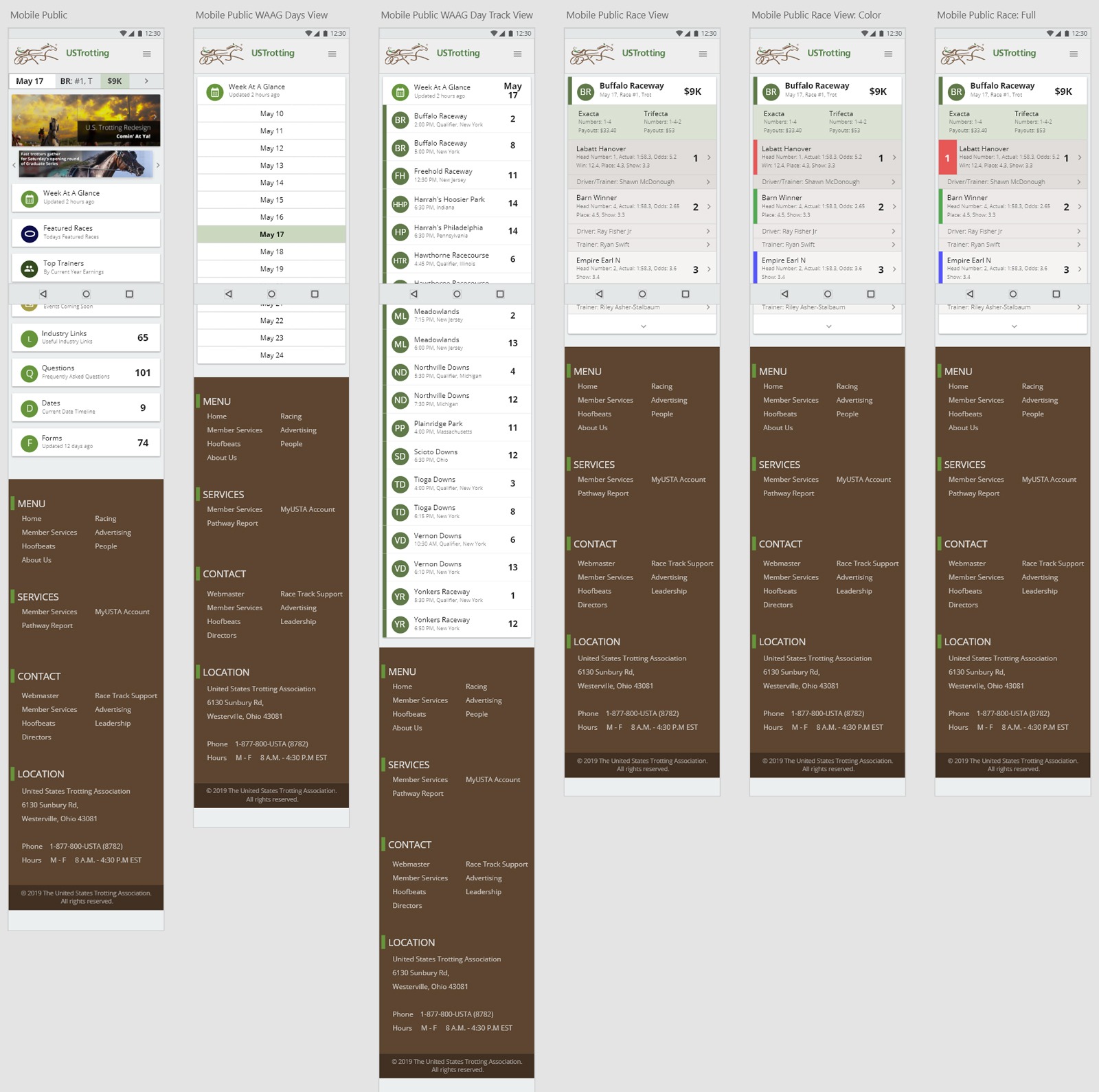
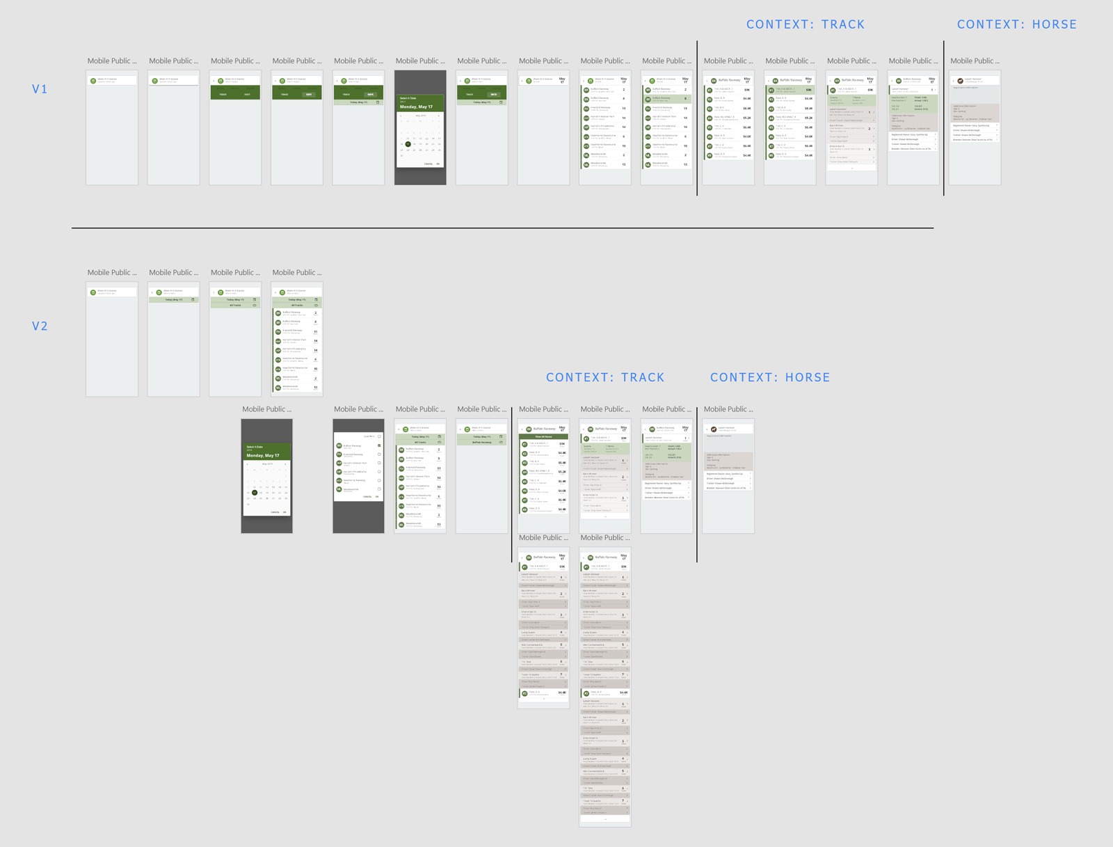
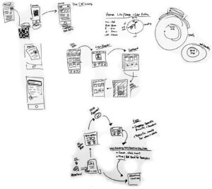
I created and presented a range of low-fidelity prototypes, including wireframes, mockups, and sketches, for cross-functional review, enabling rapid feedback and feasibility assessment with team members and subject matter experts.
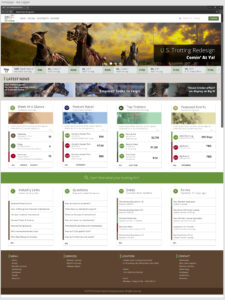
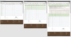
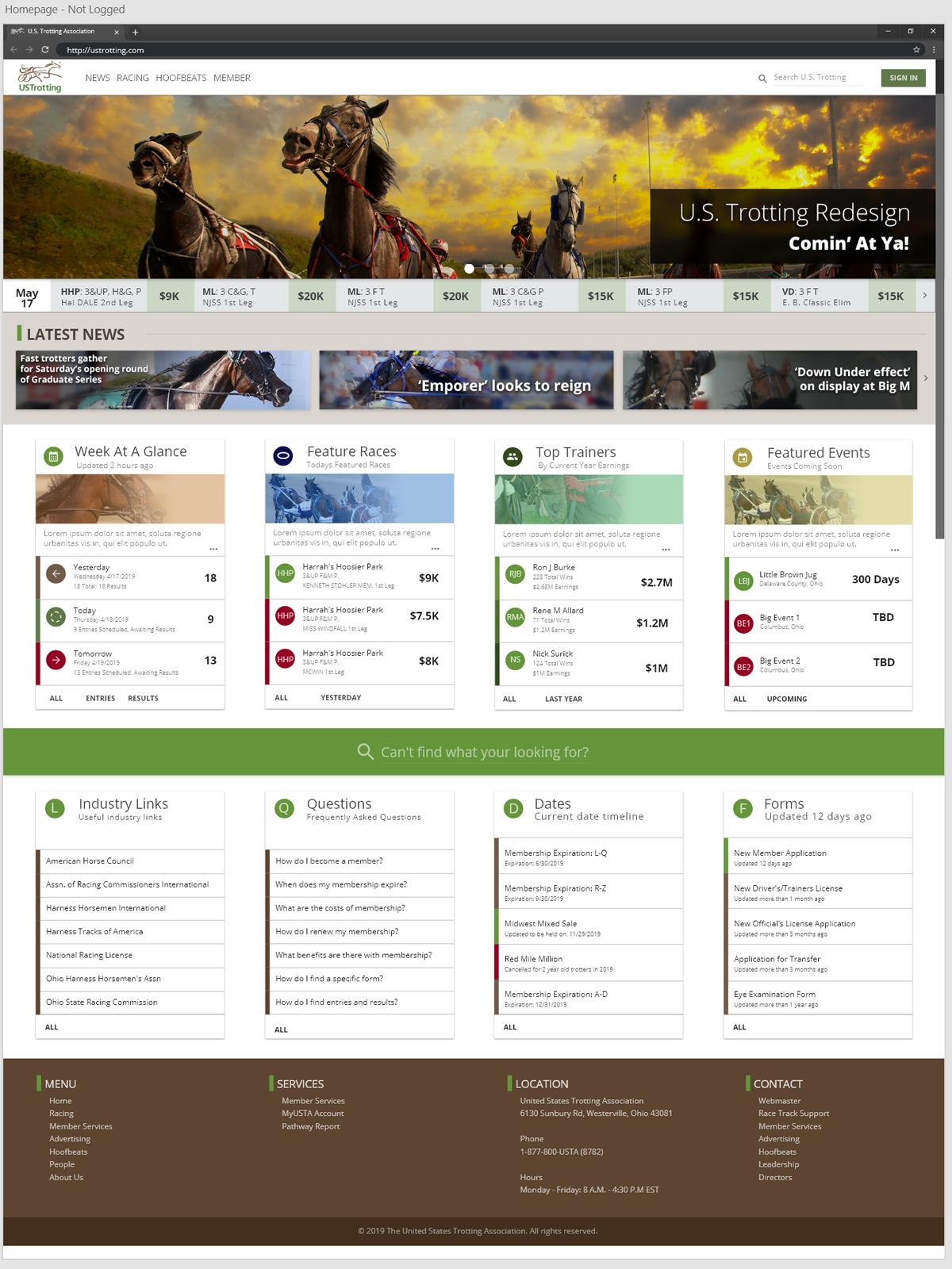
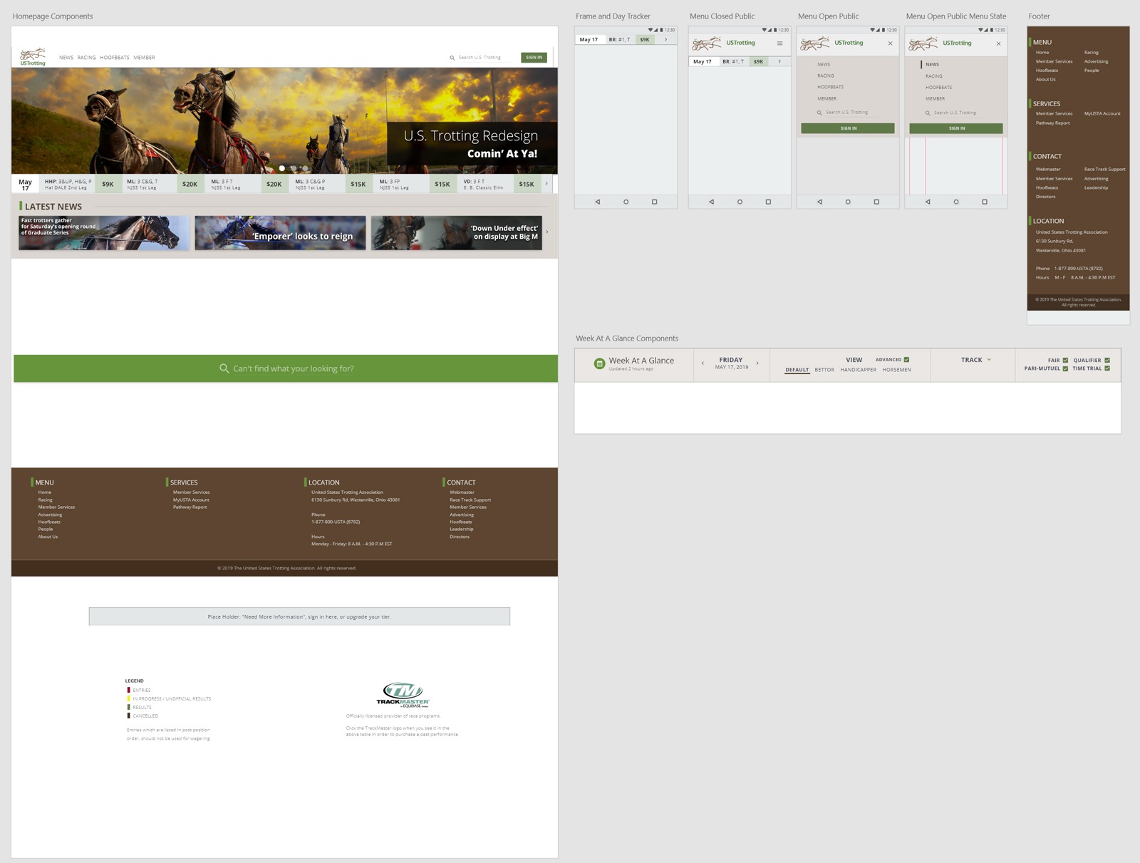
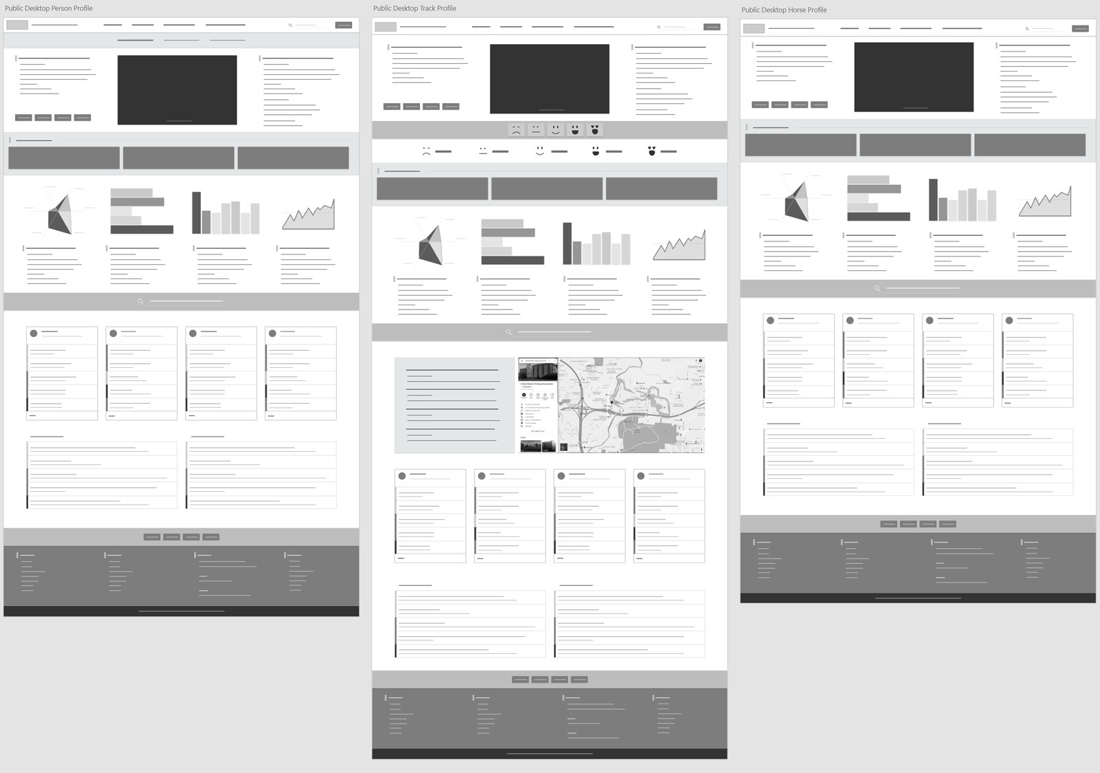
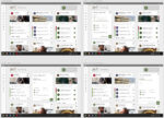
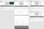
High Fidelity
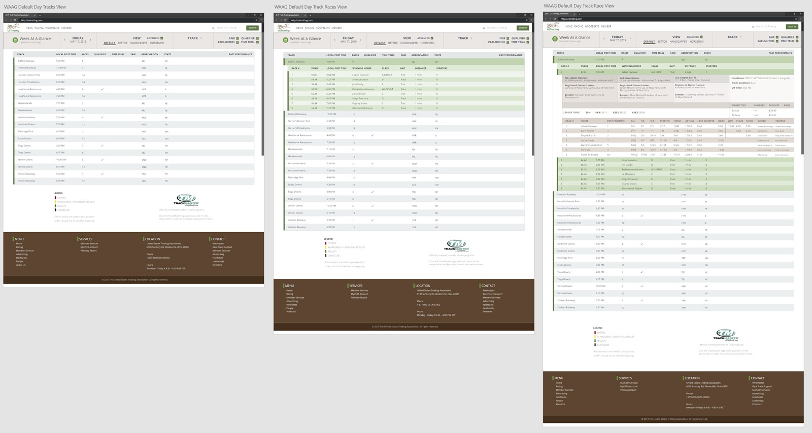
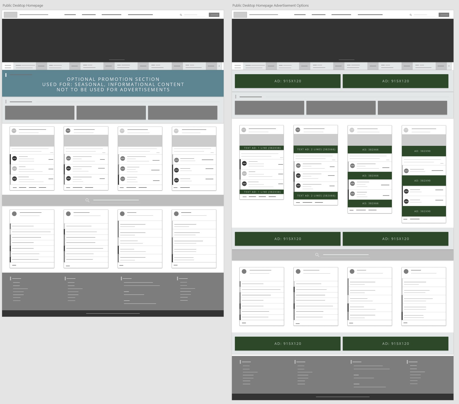
Presented high-fidelity designs and concepts to leadership for feasibility and information architecture evaluation, driving collaborative input from subject matter experts and ensuring alignment across teams.
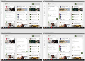
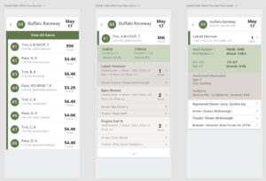
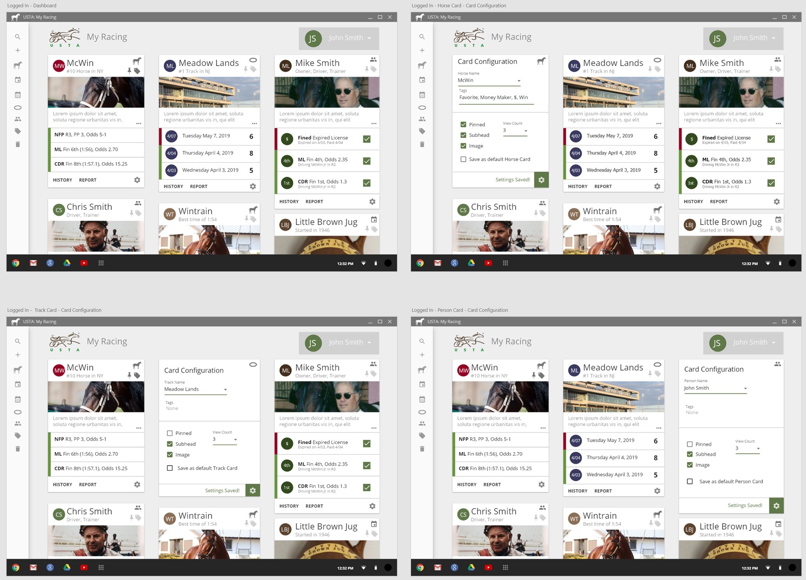
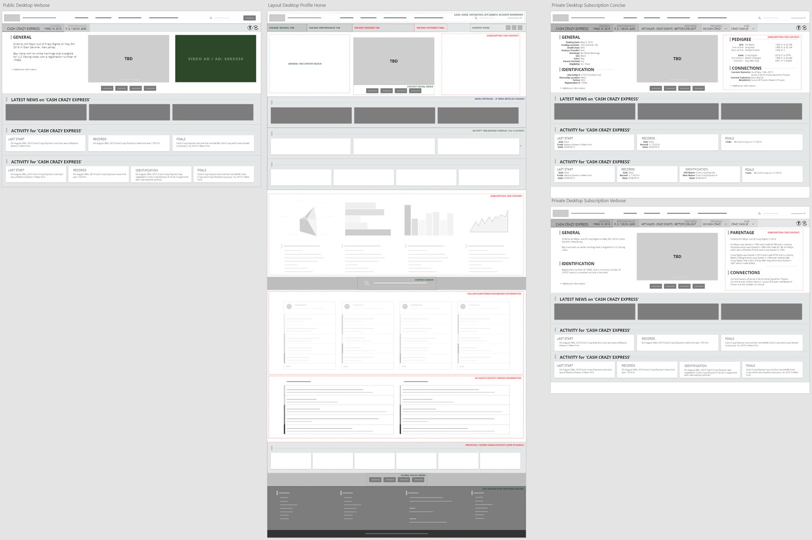
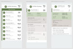
Interactions
Delivered and presented interactive prototypes to leadership, project teams, and subject matter experts, facilitating alignment and actionable feedback throughout the design process.
Learn More About This Case Study
-
USTrotting Phase 1 – Data & Analysis
USTrotting Case Study – Data & Analysis page defining the…
-
USTrotting Phase 2 – Ideation
USTrotting Case Study – Ideation page defining the work that…
-
USTrotting Phase 3 – Design
USTrotting Case Study – Design page defining the work that…
-
USTrotting Phase 4 – Develop
USTrotting Case Study – Design page defining the work that…